
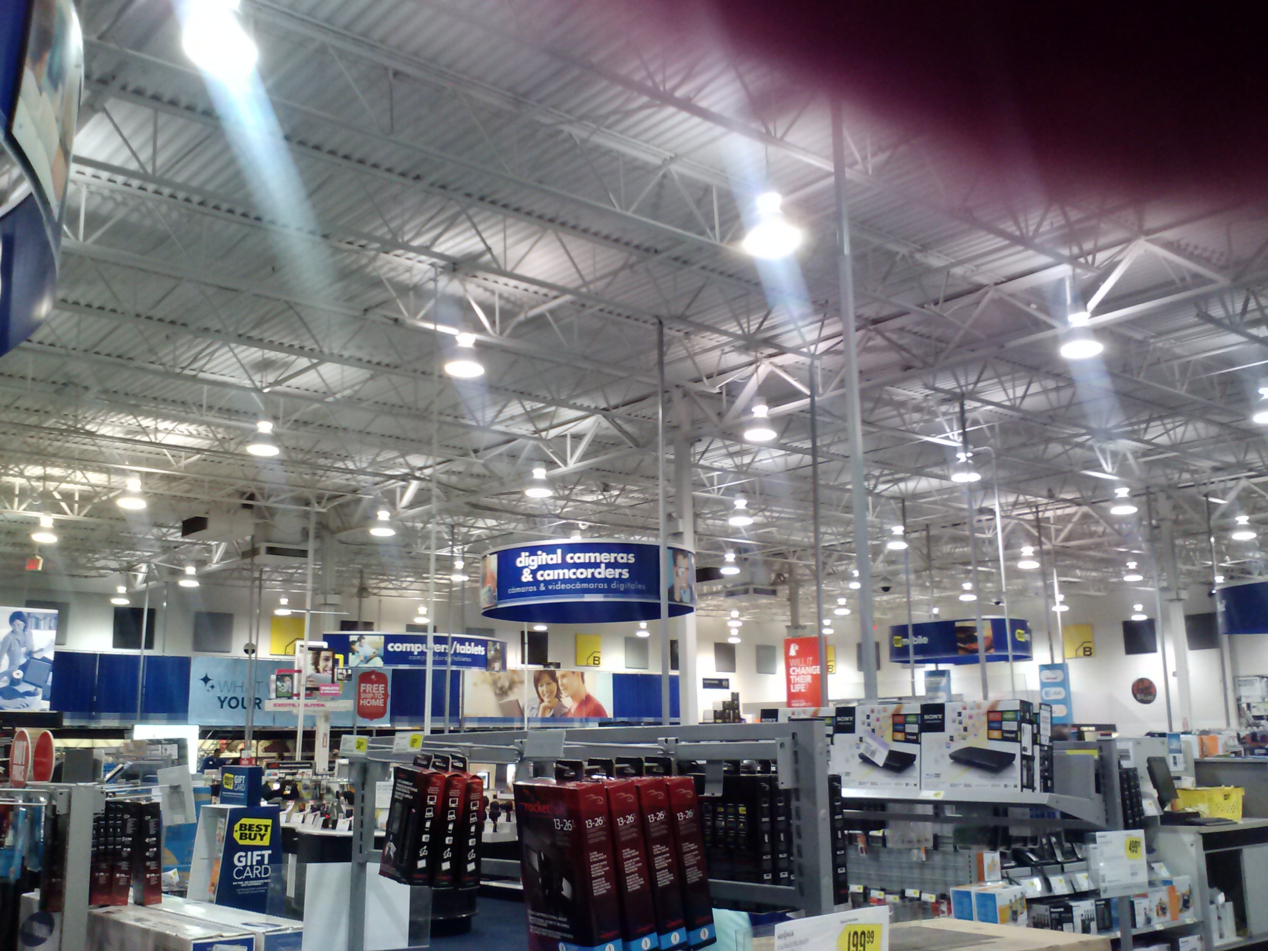
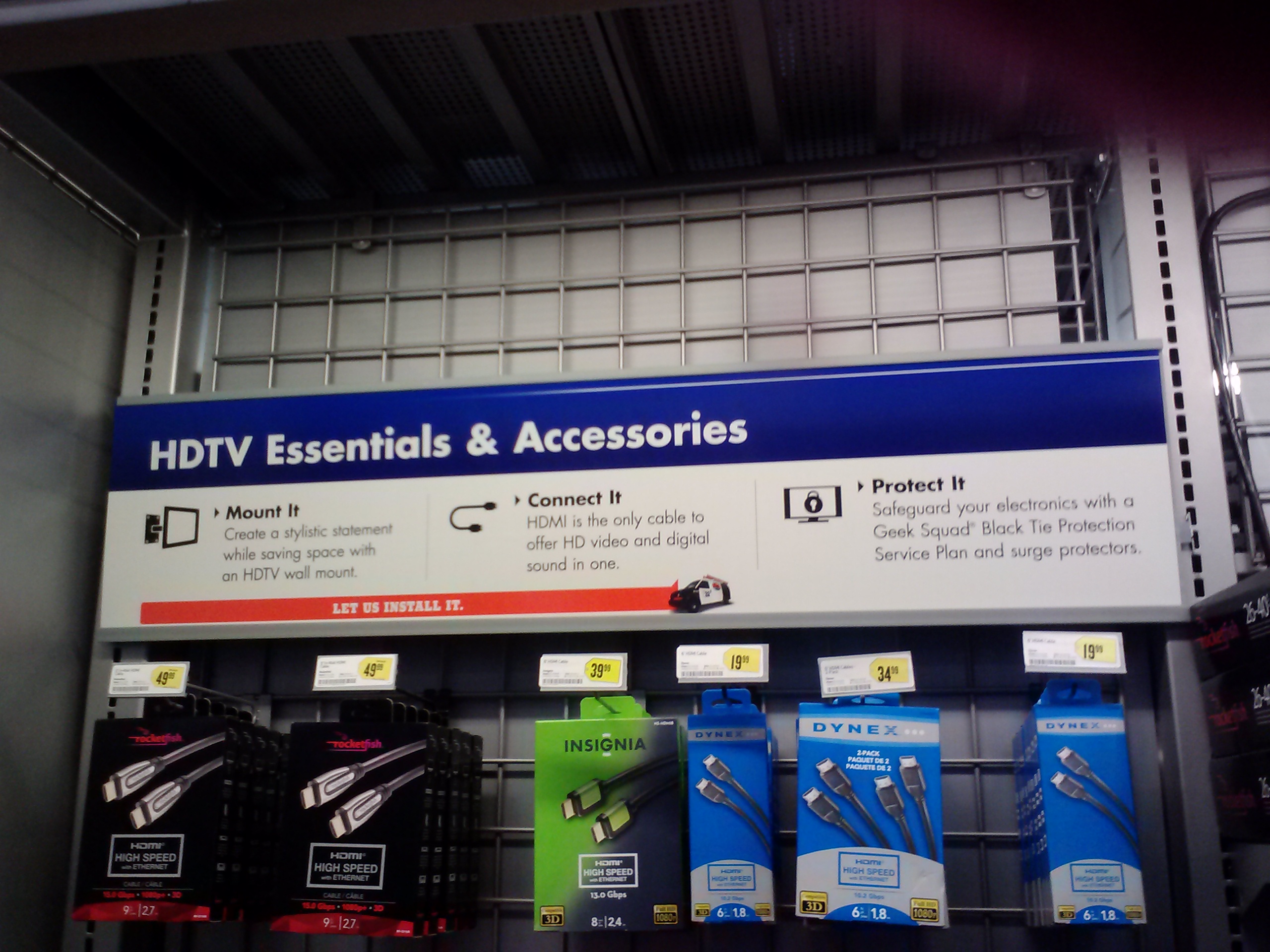

These previous pictures are from Best Buy. I am very impressed with the way they display information with wide open spaces surrounding the signs. Since the signs are spread out, It helps customers find different sections of the store. What also help are the colors of the signs. Our textbook states the following: “An extremely important tool for an information designer, color is a very effective way to convey differentiation. Color can also provide a sense of wayfinding, allowing readers to scan text and quickly isolate elements such as subheads and bullets” (Baer 90). Most signs use dark backgrounds with light text, so the signs not only stand out, but they are readable. The store also uses a good sense of grouping. Our textbook also states the following about grouping: “Clustering information can help readers quickly locate the information they are seeking, whether it be in a simple poster or a complex multi-media project. Multiple entry points allow a reader to absorb information as visual sound bites. The grouping of information can also signal hierarchies of importance, particularly when used in conjunction with changes in color, weight, and scale” (Baer 106). The second picture consists of HDTV Essentials and Accessories and states information under each step to elaborate some more.
This store is designed for audiences that have computers and have knowledge on how to connect and repair them. Best Buy also has an audience for video game, music, television, and movie lovers. Many people keep up with current technology, and Best Buy makes sure to make the information understandable for their customers.
Baer, Kim. Information Design Workbook. Massachusetts: Rockport, 2008. Print.
